
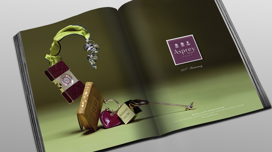
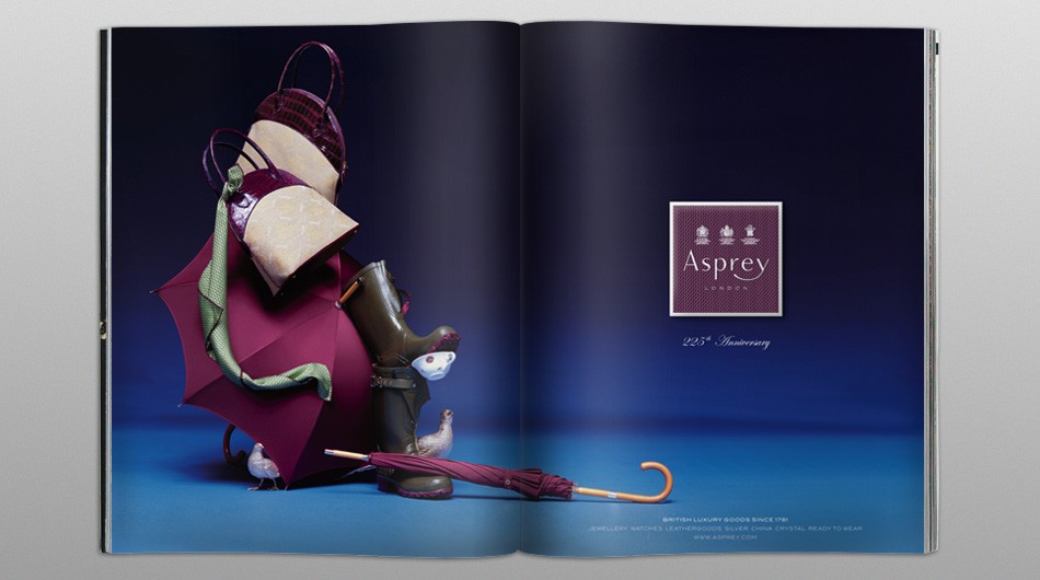
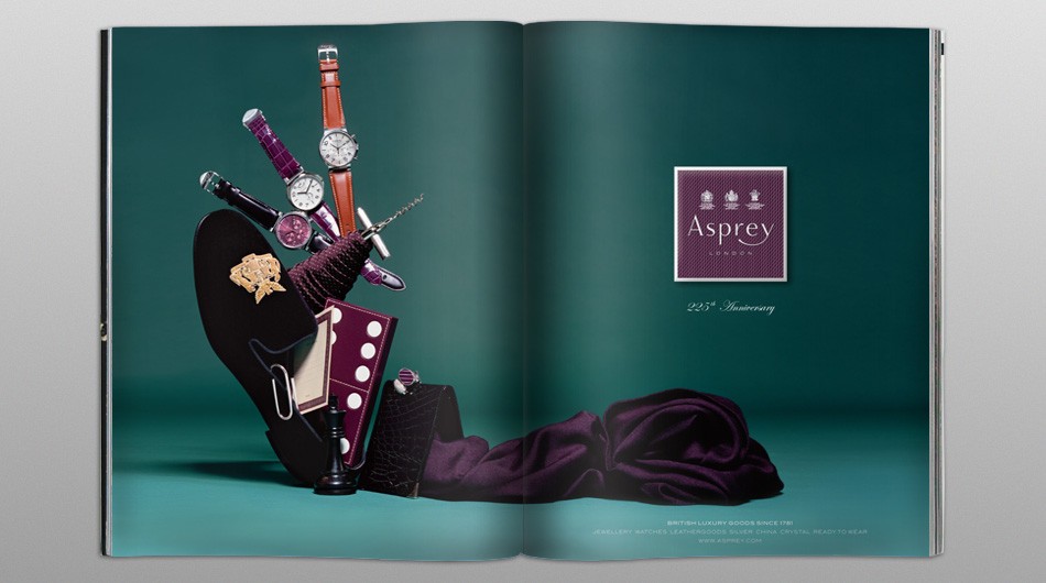
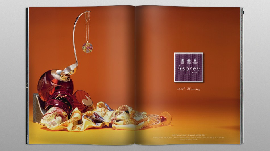
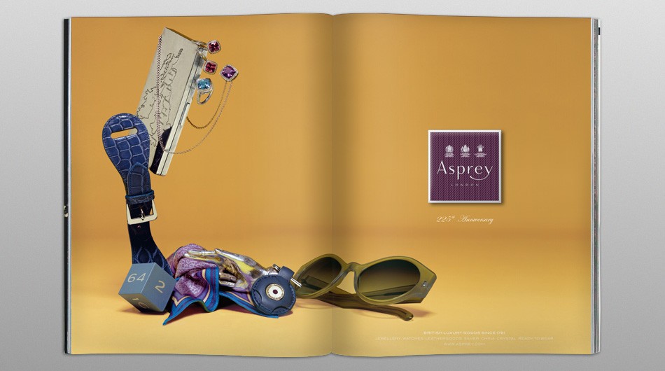
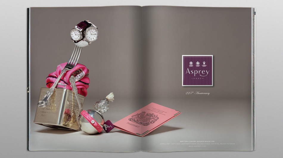
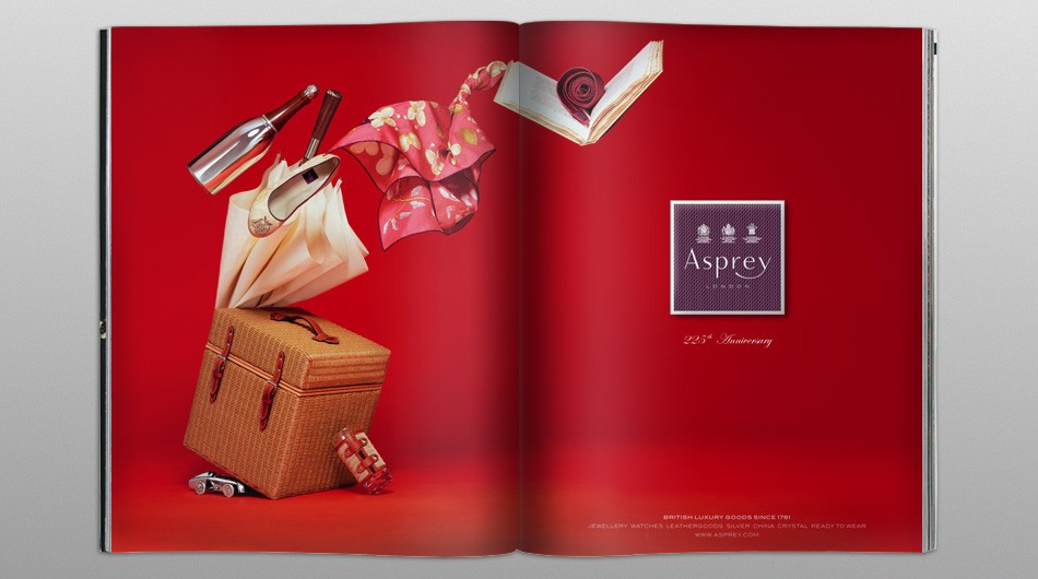
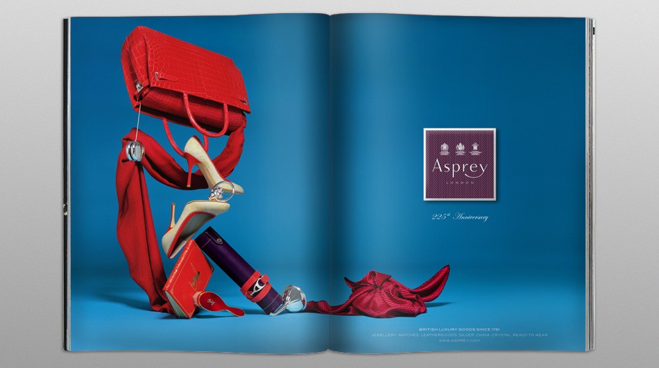
This unique and beautiful still life campaign brings contemporary vitality to the grandeur of the Asprey products. Coloured shaded backgrounds are the perfect setting for unique products compositions that open the doors to great imagination and craft.
A meticulous attention to details has been crucial to create harmonic and elegant forms enhancing all products details and creating a suggestive British atmosphere. The smart game of alternating soft and harder shapes gives a nice balance to the overall images.
We introduced the new Asprey “box” logo to simulate the top of the traditional Asprey packaging in a sober and refined way. The bolder logo allowed the use of Asprey iconic pattern and colours within the adverting communication strengthening the brand identity and awareness within the marketplace.
The campaign was declined as well for single page formats and it run in UK, US and Japan. Detailed advertising guidelines were provided to ensure the correct use all materials.
Asprey represents style, refinement and quality – British classicism expressed with a modern sprit founded in 1781. Asprey is still today the ultimate authentic British luxury lifestyle house. Asprey is renowned for fine jewellery, watches and clocks, leather goods, silver, china, crystal, ready to wear accessories and fragrance.
9 subjects – Photography: Erwan Frotin